One commonly used principle in interfaces is Fitts’ law. It can be boiled down very simply: the ease with which you can access a click target (like a button) is decided by how close it is to the current cursor position and how big it is. A nearby or big target is easier to reach than a far away or tiny click target. Very straightforward when you think about it.
There’s one more aspect, though: the edges and especially the corners of your screen are effectively huge. To click on a tiny button on your screen, you have to move your mouse to the general area (often starting with a large, imprecise mouse movement) followed by a slower precise movement to get to the right target, making sure not to overshoot. But if the button is in the top right of your screen, all you have to do is make one huge imprecise movement towards the top right. If you overshoot, it’s fine because the cursor hits the corner and stops. It’s easy to click on the corners of your screen, even though they’re often the furthest points from the cursor. It’s no accident that the Windows 7 start button is in the very bottom left corner, the close window icon is in the top right, and the show desktop button is in the bottom right. But do any games make use of this?
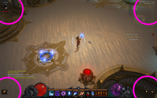
No click targets in the corners of Diablo III.
Continue reading →